Eeeee Eee Eeee - Tao Lin (2007)
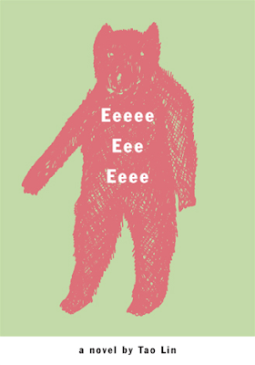
Formal Elements: The color palette is unnatural; it looks like a bear, but it’s bright pink. The bear is composed of crosshatched strokes, and the background is a pale green. The title of the book is in white sans-serif font…it is a very simple cover design, which in conjunction with the cryptic title it makes me wonder if it’s a complicated story.
Iconography + Intrinsic Meaning: Bears are used in imagery to represent a number of things, ranging from cuddly caretakers to nightmarish pursuers. Because the bear is in a gentle shade of pink, it’s uncertain if its meant to be a malicious or gentle bear. The scratches have a handmade appearance, whereas the typeface of the book is in sans-serif, lacking the humanist touch of a handmade typeface. Bears mean different things to different cultures; researching the culture the author, Tao Lin, is from might provide more understanding about his own influences and background. Obviously reading the story will ultimately (or hopefully) provide an explanation for the cover design.
All I'm saying is that's no gentle shade of pink. It might as well be about a bear who was raised by monkeys or some kind of educational book using only words that start with 'e'. And so forth. Anyways.

No comments:
Post a Comment